Why your user experience should not be like Flinders St Station
I far prefer the full term ‘user experience’ to UX. And yes, I know that they’re supposed to be the same. I have a theory that the abbreviation UX sometimes shortcuts our personal neural network (that is, our brain) into shortcutting the meaning; often just to design, or ‘usability’. And in my opinion, that’s not quite the same thing.
User experience is everything that’s felt, thought, done, touched – experienced by the actual real life human who happens to be our user. A ‘highly usable’ design that’s beautifully and faithfully crafted into code can still have a totally horrible user experience. And that’s because all of us humans are different – we think differently, we emote differently, we react and explore differently. What might work for 99 percent of the users doesn’t mean it works for the one percent – hence a great design can still suffer from bad user experience.
And it’s really important to remember the user’s reaction here is correct. Whatever their reaction is ( good, bad or in between ) – it is their experience, so it’s right. This is the same principle as taste in food or drink. I’ve been lucky enough to eat in some pretty fancy restaurants…where my wife has taken a nibble of the chef’s latest must-have signature dish…then push the plate aside. Is the chef right? Or my wife? ( hint: it’s my wife. She’s always right 😉 )
So when we think about user experience, we have to target a great experience for most users. The trick is working out what that word ‘most’ means to you. Is it ‘all paying customers’, or ’95 percent of new users’ or ’90 percent of experienced users’ or (roll your own definition here)? And I hear you UX designer; you’re pretty awesome so you always design for all users. Uh huh. Have you seen your parents use software? Compared to a millenial? Or a teenager? You wanna keep telling yourself you’re designing for all ( and achieving for all ). Go right ahead, I’m not here to stop you, and yes – that is a unicorn outside your window.
So I’m often thinking about user experience in lots of everyday scenarios. Have you ever thought about your user experience whilst driving – say with signage and directions? How about when parking the car – trying to read 15 different time based instructions on a sign 30 meters away. How was your user experience? How about going through the airport scanners…are iPads OK in the carry-on or not? ( and why is this different at every airport? ).
And one of my everyday activity is getting the train home at night. Now I’m doing this five days a week since like forever, so it’s pretty easy to turn the brain off, get into auto mode and get home. But every now and again I like to ask why is this experience like this? Does it have to be?
Flinders Street Station is the original railway station for Melbourne, with version one being launched around 1854. Version two, which is the design still in use today came out in 1910. Not only was it the first, it’s also considered the most famous and arguably the most interesting of our stations. So it’s pretty impressive that the building is largely still intact, and it’s still serving its core function of moving people into and out of the city.
So let’s get back to that user experience. I have one objective – get on the train taking me home. This bit’s pretty easy right? I need to do only a couple of things:
- Validate my electronic ticket, then
- Find the platform that my train leaves from.
Again, it’s super easy. And yet it’s not – because the user experience of Flinders Street station, and to be specific of the Elizabeth Street entrance totally sucks has room for improvement. Let’s go through what it looks like.
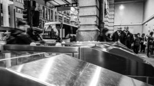
First up, let’s take a look at validating the ticket. It’s a pretty common scenario – gotta swipe my electronic ticket to get through the barriers. So far, so common. But take a look at what’s in between me and the barriers. We’ve got a roadway, then a footpath. So let’s break down what happens most nights for me.
Naturally enough, I wait for the green man to let me cross Flinders Street. So the first problem is that there’s lot of people waiting to get home with me. And they’re arriving second by second. So rather than being able to validate as they arrive – instead they’re being grouped into one big mob. And those barriers…well hardly anyone is using them, because they’re all on the other side of the road. With me.
So the green man flashes and the mob’s off. There’s a few different walking speeds – but those barriers now have a ‘peak within a peak’ problem. That is – they’ve got 120 seconds worth of arrivals…all arriving at near enough the same time. So that’s going to result in…queuing.
Which leads to the next problem…there’s only about nine feet of pavement between the barrier and the road. Do not get into the queue late….otherwise you’re standing on a roadway. Literally standing on a roadway with cars driving at you. I mean who could’ve have predicted that there would be queues here at peak time eh?
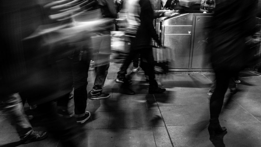
But now we get to my favourite part. Because let’s say you’ve got to the head of the queue early, and you’re through the barriers. My next task – find the platform. Now the platforms for my trains do change from time to time – but there’s really only a choice of three. I just need to know which one – and a guide to ‘hurry up’ or ‘dawdle’ would be kinda nice.
Great news – the station authorities know this, and so we have lots of super helpful screens to help me. So I look up at those screens, trying to identify the option that’s meaningful to me. In the meantime, there’s a queue of people going through those barriers that are now behind me. I gotta give them room, so I’m moving forward, whilst looking up at the screens…only to be confronted with a relatively steep set of stairs.
Yep that’s right – you’ve got hundreds of people a minute coming through, and the design forces their vision up, whilst forcing them to walk down. There’s often enough people in this space to block your view of the stairs, so that first stair is frequently a surprise to commuters. And not in a good way.
I go through this process every night, so it doesn’t cause me any real issues. I’m pretty tall – I have a better view of pedestrians, the barrier queues and the screens than most. But I’d hate to be a first time user. I’d hate to be a tourist. I’d hate to have restricted mobility or sight – it would be unimaginably stressful.
Every time I go through, there’s stressed out commuters blocking traffic, blocking barriers, blocking the stairs. Which generates more stressed out commuters – getting bumped or blocked or moved around. There’s no aggression; we’re all in this together but there’s undoubted additional and unnecessary stress being generated. And it’s across the majority of users working through this entrance. If you’re not sure – spend five minutes watching it one night.
 And that’s why your design, your system, your user experience should not be like Flinders Street Station. Because it takes two relatively simple tasks – and together turns them into stress. If one was to analyse each one separately by the way – you might suggest that the station is doing an OK job. But user experience is not about separate components (“Can they find this button?” or “Will they see the warning message?”) – it’s about the totality of the user objective, and how that translates into tasks – and then how easy it is for a broadest range of users to work through those tasks. Great user experience is what we all aim for ; and it’s most apparent when it’s not apparent. Cos it just worked.
One thing I’m going to note here: it’s really easy to criticise other people’s work. And that’s not my aim here; because in the real world that user experience documented above is dictated by a lot of real world constraints – such as 100 years of history, and heritage overlays, and pre-existing roads and entrances that were never designed for that many people, nor electronic barriers. User experience is the totality of our human reactions, and user experience is everywhere you look.